Digital Presence
Soni Paithani - Designing a heritage-led website
Client: Soni Paithani
Scope: Website Design · UX · E-Commerce · Brand Positioning
Industry: Luxury Retail · Heritage Textiles
The Brand
Five decades. Ten awards.
One digital problem.
Soni Paithani has been manufacturing Paithani, silk, and designer sarees for over fifty years. In that time, they have earned recognition from the Governor of Maharashtra, been named Nashik’s top saree shop by Lokmat, and received awards from Zee Marathi, Dainik Bhaskar, and IBN Lokmat, among others. Their customers include women across the UK, the US, and the Indian diaspora worldwide — people for whom a Paithani saree is not a purchase but a connection to home.
The brand had the legacy. It had the product. It had the awards and the loyal national & international audience. What it did not have was a digital presence that reflected any of it.
Refinement
The Challenge
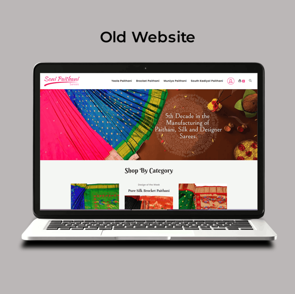
What the old website communicated
A brand’s digital presence makes a promise to every visitor before a single product is seen. For Soni Paithani, the promise being made by their previous website did not match the reality of what they offered.
The visuals lacked the premium register the product deserved. The site did not tell the brand’s story. And critically, it did not speak to the modern, design-aware buyer — who might discover the brand online and need to feel the brand’s world before committing to an inquiry.
The challenge had three distinct layers. First – make the digital experience premium. Second – carry the weight of a fifty-year legacy. Third – build something that worked equally well for a first-time visitor and a returning customer.
Expression
Research & strategy – The starting point was understanding who the brand was actually speaking to. Soni Paithani’s customer is not a single type of person. She is a woman in Nashik buying for a family wedding. She is a woman in London who grew up watching her mother wear Paithani and wants to carry that forward. She is a younger buyer in Mumbai who has discovered the brand on social media and needs the website to convince her that the product is worth the inquiry. What united all three was this: they were not coming to the website to be persuaded. They were coming to be confirmed in a decision they were already close to making. The website’s job was not to sell. It was to make the brand feel worthy of the trust they were already willing to give it.
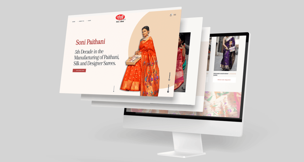
Concept & design direction – The design direction was built around one idea: modern luxury that is rooted, not restless. The layout gave the product photography the space it needed to communicate quality before any copy was read. The brand’s positioning line was placed as a structural element of the homepage, not as a footnote. The awards section was given genuine visual weight for the first time, framing them not as credentials but as evidence of fifty years of trust. The inquiry-based model was treated as a premium signal rather than a technical limitation. At the price points Paithani sarees command, direct inquiry is appropriate. The design reinforced this: the call to action throughout is an invitation to a conversation, not a prompt to add to cart.
Development & execution – Five product categories, each given space in the navigation and collection pages that allowed the range to be communicated clearly without overwhelming the visitor. The process was collaborative throughout. Feedback was incorporated at each stage, and the final result was, in the client’s own words, ‘exactly what we had envisioned, and more.’
Strategic
Key Design decisions
Three decisions worth understanding
01. The heritage framing – Most heritage brands treat their age as a fact. Soni Paithani’s fifth decade in manufacturing was instead placed as the opening statement of the brand’s story — not a date in a footer but the lens through which everything else is understood. When a visitor arrives on the homepage, the first thing they understand is that this brand has been trusted for fifty years. Every product they see after that is evaluated through that frame.
02. The awards as proof, not decoration – Ten industry awards sit in Soni Paithani’s history. On the previous site, they were either absent or presented as a list. The redesign gave them a dedicated section with the context each award needed to communicate its significance. Each award tells a different part of the brand’s story.
03. Designing for the diaspora buyer – The international buyer arriving at this website from the UK or US is making a decision that carries emotional weight. She is not just buying a saree. She is reconnecting with something. The website needed to make her feel that Soni Paithani understood that. The language, the imagery, and the positioning line ‘Handcrafted for the Global Woman’ were all calibrated to speak to that specific feeling without making it sentimental or generic.
Clarity
“She understood exactly what we had in mind — a website that not only looked elegant but truly reflected the heritage and premium nature of our brand.” — Soni Paithani
What this project taught me
The Creative Director's Reflection
Heritage brands present a specific design challenge that is easy to mishandle in two directions: you make them feel contemporary and lose what made them worth trusting, or you make them feel traditional and lose the audience you needed to reach. Soni Paithani required walking that line with precision.
The insight that changed the project was understanding the inquiry model not as a limitation but as a signal. A luxury product with personalised pricing invites a conversation rather than a transaction. That’s not a weakness in the e-commerce experience — it’s an accurate reflection of how high-value, handcrafted pieces are actually bought. Designing around that reality, rather than against it, gave the website its character.
The other learning was about the diaspora buyer specifically. Designing for someone who is emotionally connected to a product — not just rationally evaluating it — requires a different calibration of every element. The photography, the language, the pacing of information on the page. When someone arrives at a website because they feel something, the design has to honour that feeling before it does anything else.