
Digital Experience
Artisan Bay - Structuring a modern digital experience
Type: Self-Initiated Strategic Case Study
Scope: Website Strategy · UI Design · E-commerce Experience
The problem worth solving
Bags became inventory.
Artisan Bay made them a considered choice.
E-commerce has standardised how products are presented. Categories. Grids. Filters. A system optimised for speed, not understanding.
For products like bags — spanning materials, purposes, and users — this structure flattens distinction. A travel backpack, a leather office bag, and a casual sling often sit within the same visual hierarchy, differentiated only by labels.
Artisan Bay was built around a different premise: that an e-commerce experience can organise variety without overwhelming it
Framework
Design Strategy
The strategic foundation
The first decision was defining what kind of e-commerce experience this needed to be.
The product range is diverse — casual, office, travel — across materials and styles, for both men and women. The challenge was not lack of variety, but how that variety is presented.
Instead of designing for a specific aesthetic, the focus shifted to designing for navigation clarity helping users move through categories, understand differences, and find relevance without friction.

Interaction
"For individuals navigating multiple needs and styles, Artisan Bay is an experience that structures variety into clarity making product selection intuitive rather than overwhelming."
Visual Identity
The interface was designed to support variety without amplifying it.
With multiple product types and categories, the system needed to remain visually neutral, allowing each product to retain its identity without competing with the interface.
No dominant stylistic imposition.
No heavy visual signatures.
The design holds the system together, while the products define the variation.
Website Structure
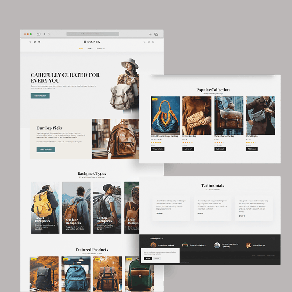
The browsing experience
The homepage establishes the organisational logic immediately. Instead of presenting all products equally, the interface introduces structure through sections — top picks, category-based groupings, and featured collections.
Light backgrounds maintain readability and openness, while darker elements provide structure and separation between sections.
The palette does not attempt to define the brand visually. It creates a stable environment for product diversity.
Balance
What this project taught me
The Creative Director's Reflection
Artisan Bay was less about visual expression, and more about organisational clarity.
Unlike projects where the challenge is to define a distinct aesthetic, this required designing a system that could accommodate difference without becoming inconsistent.
The instinct in e-commerce design is often to amplify — more visibility, more emphasis, more urgency. This project required restraint in a different way. Not removing elements, but structuring them.
This project reinforced that in functional categories, design is not about reducing information but about arranging it with intent.