Brand Identity
Shakya - Building a distinctive brand identity
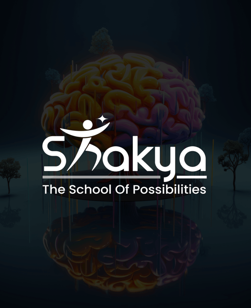
Client: Shakya — The School of Possibilities
Scope: Logo Design · Visual Identity · Brand Collaterals
The Brand
A brand for people who are becoming something more.
Shakya — The School of Possibilities — was preparing to launch as a platform for life coaching, personality development, soft skills, and fast learning. The name itself carries philosophical weight: Shakya refers to potential, to capability, to what becomes possible when limitations are examined rather than accepted.
Personal development is a category crowded with empty promises and inflated language. Shakya needed to feel different from the first moment of contact — credible, grounded, and genuinely aspirational without resorting to the category’s clichés.
Signal
The Challenge
The constrained brief
The brief came with a specific creative requirement built in: the logo had to incorporate a human figure reaching for a star. It was a non-negotiable element.
This kind of constrained brief is one of the more interesting design challenges there is. The symbol the client described is entirely right for this brand.
The risk was in the execution. The challenge was not to question the brief. It was to honour it at a level of craft that made the inevitable feel inevitable — where the mark looked like it could only ever have been the Shakya logo, not a stock illustration with the brand nameattached.
Experience
The Approach
From constraint to mark
Research & brand understanding – The starting point was the category itself. Life coaching and personal development brands tend to communicate in a register that is either corporate and motivational or soft and spiritual. Shakya needed to occupy different ground: professional enough to be taken seriously by parents making decisions about their children’s development, and warm enough to be trusted by the people those children would become.
Making the constrained element distinctive – The human figure reaching for a star was the given. The question was: what kind
of human figure, and how does it reach? The answer came from Shakya’s name and philosophy. The figure is not straining. It is not depicted in effort or struggle. It is depicted in the moment just before contact — the point of almost-reaching, where potential is most alive. Done wrongly, the symbol communicates either frustration (the star is too far) or ease (the star is too close). Done correctly, it communicates exactly what Shakya offers: a direction that is genuinely reachable with the right guidance.
Visual identity & collaterals – Once the mark was established, the visual identity built outward from it. Colour, typography, and layout across the collaterals — visiting cards, flyers, standees — were all calibrated to carry the same register: professional, motivated, and grounded. The brand colours needed to communicate energy without aggression, aspiration without arrogance. The typography needed to feel contemporary without being trendy.
Feedback & delivery – The process was collaborative. Feedback was welcomed and incorporated at each stage. The final delivery included all brand-ready files in required formats — print-ready and digital versions, all assets organised for handover.
Strategic
Key Design Decisions
Two decisions worth understanding
01. The figure’s posture – The brief specified a human figure reaching for a star. Most aspirational icons in this category depict effort. That posture communicates struggle. Shakya is not a brand about struggle. It is a brand about possibility. The posture chosen is composed rather than strained. It is the difference between a brand that says ‘this will be hard but worth it’ and a brand that says ‘you are capable of more than you currently believe.’
02. The minimal form – The decision for Shakya was to go minimal not because minimal is always the right answer, but because a minimal figure is universal. It does not have a gender, an age, a body type, or a background. That universality matters for a brand whose audience is genuinely diverse.
Consistency
“She doesn’t just meet your expectations. She exceeds them.” — Team Shakya
What this project taught me
The Creative Director's Reflection
A brief that specifies a visual element can feel like a constraint on creativity. It is not. It is a different kind of creative problem: not what to show, but how to show it in a way that feels specific and inevitable rather than generic and assembled.
The Shakya logo brief was the most constrained of any project in this collection. It was also, in its own way, the most clarifying. When the direction is given, the work becomes entirely about craft — the quality of the line, the posture of the figure, the distance of the star, the weight of the mark at small sizes.
What I learned from this project is that the most important creative decisions are often the smallest ones. The difference between a generic aspiration icon and the Shakya mark is a matter of posture and proportion. Those are not dramatic
choices. They are precise ones. And precision, consistently applied across a complete identity system, is what makes a brand feel considered rather than constructed.
Next project
Brand Visibility Systems — Social Media Collection
Brand Visibility · Multi-Brand