
Packaging System
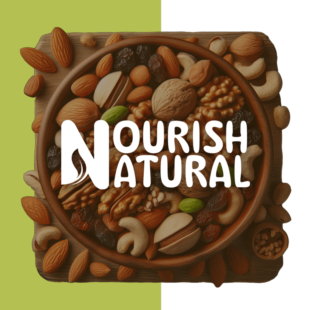
Nourish Naturals - Designing a natural and refined brand system
Type: Self-Initiated Strategic Case Study
Scope: Brand Strategy · Visual Identity · Packaging System
The problem worth solving
Healthy became a claim.
Nourish Natural made it a choice.
The healthy snack category is built on promise. High protein. Natural ingredients. No added sugar. A language driven by claims, repeated across packaging.
The result is not clarity. It is competition for attention. For a consumer trying to make a better choice, the experience becomes overwhelming.
Nourish Natural was built around a different premise: that a healthy product can communicate trust through clarity — not claims.
Perception
Brand Strategy
The strategic foundation
The packaging needed to operate in a high-competition environment. Unlike luxury categories, this is not about quiet presence. It is about being noticed — without losing clarity.
The audience is someone making quick decisions — often in-store or while scrolling — looking for something that feels both reliable and appealing.
The system needed to support that behavior. Not minimal to the point of disappearing. Not loud to the point of confusion. Visible, structured, and readable.
Identity
“For individuals making everyday food choices, Nourish Natural is a snack brand that balances energy with clarity.”
Visual Identity
The identity was built around contrast.
Clean layouts paired with bold colour blocks. Structured typography paired with expressive flavour differentiation. The goal was to create a system that feels active and engaging without losing control.
The palette is intentionally vibrant allowing each product to stand out individually while forming a cohesive shelf presence. Colour becomes the primary identifier.
Typography carries the hierarchy of information — ensuring readability even within a visually active layout.
The product world
Multiple variants. Each designed to stand out — while belonging to a unified system.
Direction
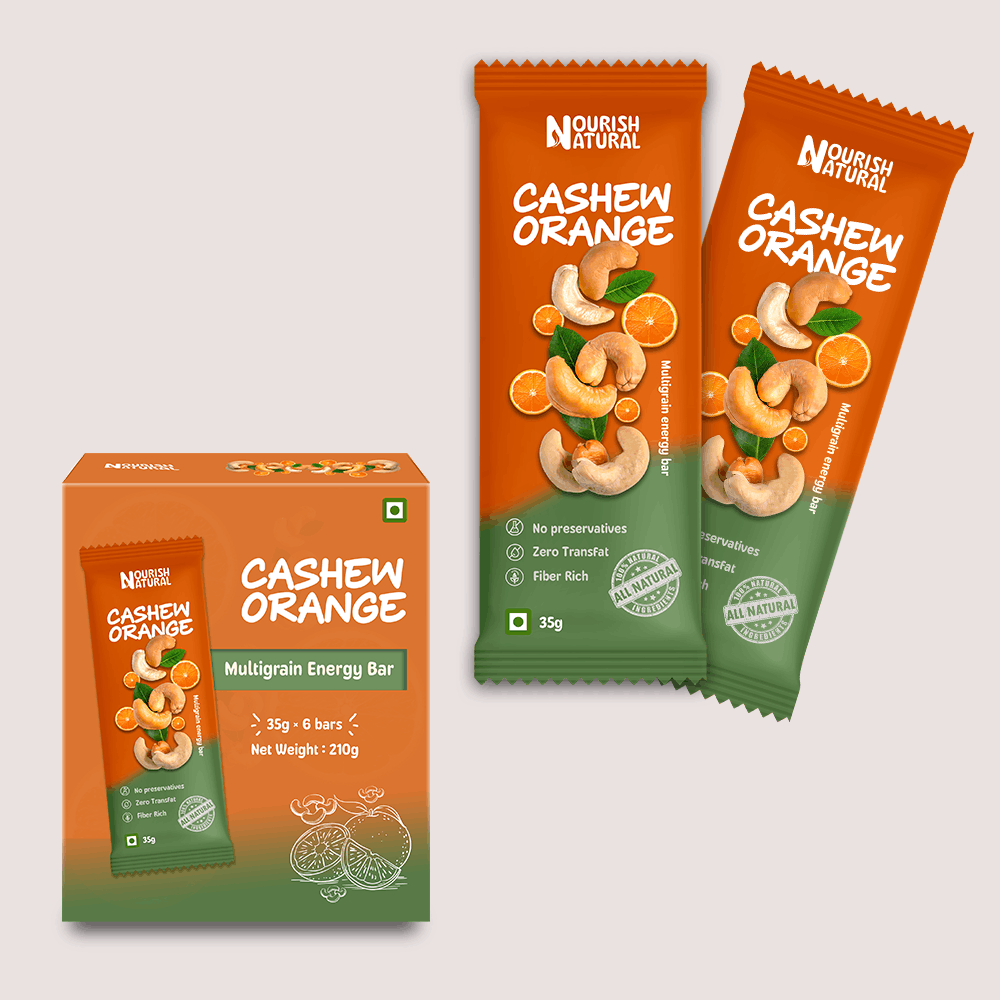
Orange Cashew
The most vibrant in the range. The orange gradient transitions into green — creating a fresh, energetic feel.
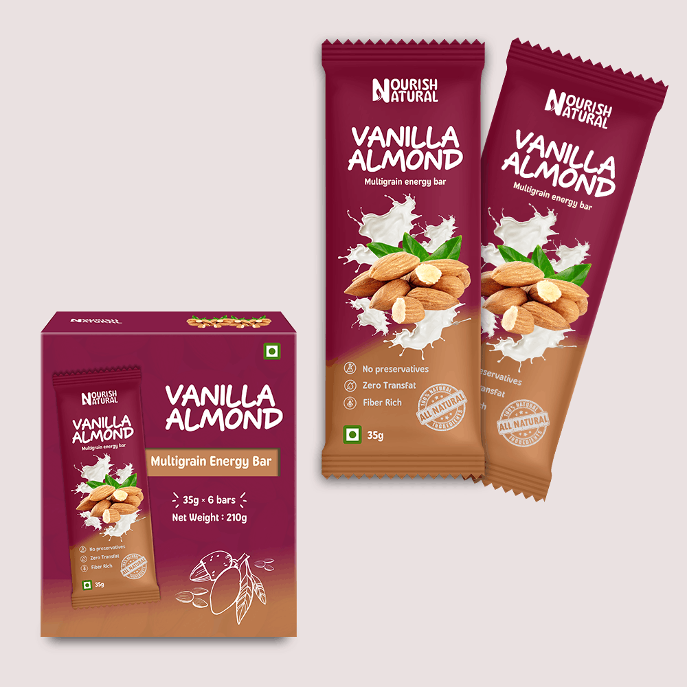
Vanilla Almond
Warmer and more balanced. The deep berry tones & soft beige gradient creates richness without heaviness.
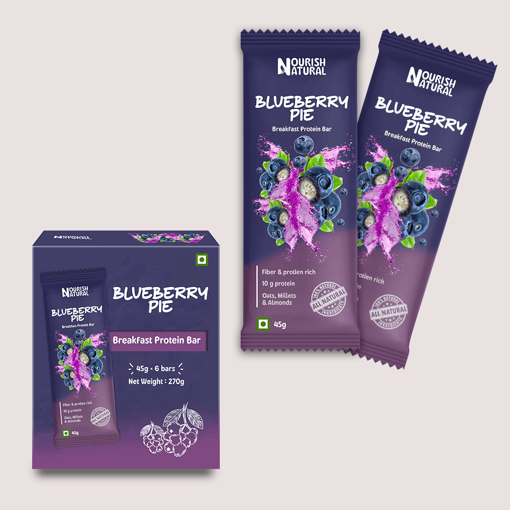
Blueberry Pie
The most expressive and dynamic. A deep purple base combined with a vivid ingredient burst creates strong contrast.
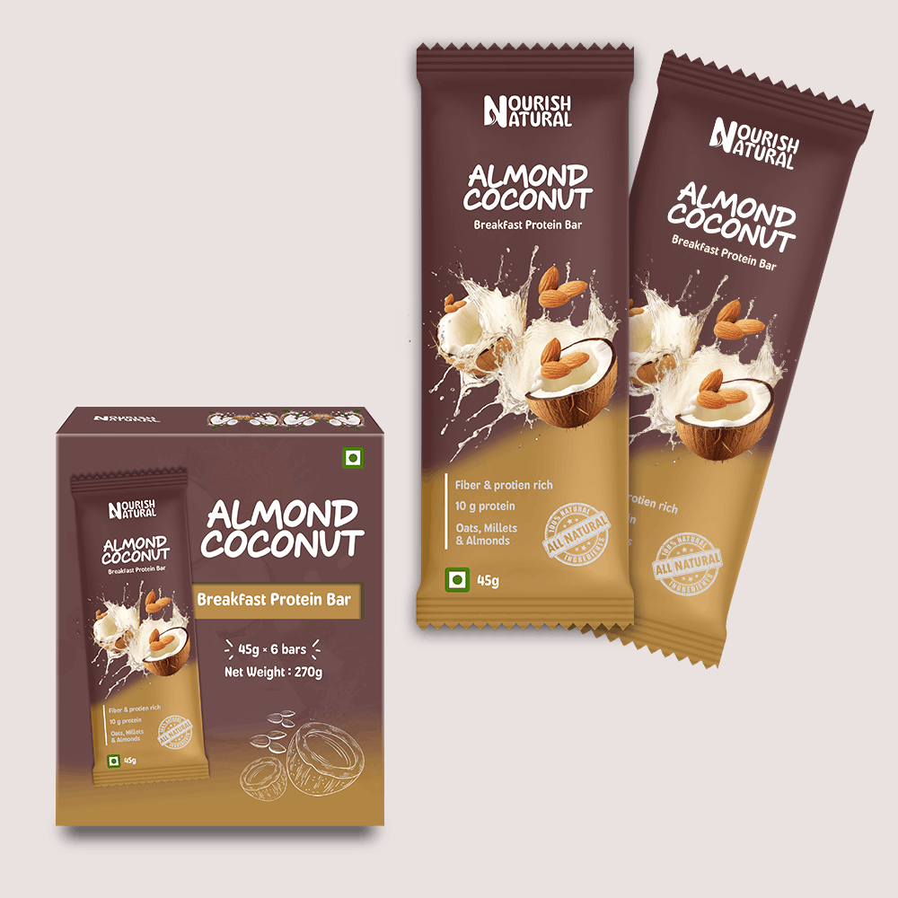
Almond Coconut
Grounded and deeper in tone. The most mature variant — carrying a sense of calm and stability.
PACKAGING EXECUTION
The packaging is designed for immediacy.
At a glance, the user understands: what the product is, which variant it belongs to, how it differs from others.
When placed together, the products create a strong visual block. Each unit stands out individually but the system holds them together. This is critical in FMCG environments.
Recognition happens collectively, not just individually.
The system balances visibility with clarity, critical in high-competition categories.
Leverage
What this project taught me
The Creative Director's Reflection
Nourish Natural was about designing for attention without losing control. Unlike minimal categories, this required working with energy. The challenge was not reducing elements. It was organising them.
The instinct in FMCG design is to communicate everything at once to maximise visibility. This project required a different approach.
The most important realisation was that visibility alone does not create clarity. A product can stand out — and still be confusing. This project reinforced that strong packaging is not just about being seen. It is about being understood, instantly.