
Packaging System
Furrfresh - Packaging for modern pet care
Client: Furrfresh Pet Perfumes
Scope: Packaging Design · Label System · Visual Identity Extension
The problem worth solving
Pet care became playful.
Furrfresh made it considered.
The pet care category is visually predictable. Bright colours. Playful illustrations. Overloaded packaging. A language built entirely around cuteness, often at the cost of clarity and refinement.
The modern pet owner does not see their pet as an accessory. They see them as part of their lifestyle. The products they choose are expected to reflect that.
Furrfresh was built around a simple premise: that pet care packaging can feel minimal, refined, and thoughtfully designed — without losing warmth.
Narrative
Brand Strategy
The strategic foundation
The brief was clear — premium, minimal, and shelf-distinct. But within that, a key tension needed to be resolved. Pet care leans playful. Premium design leans restrained.
The system needed to exist between the two. The audience is a modern pet owner — someone who values aesthetics, but also emotional connection. The packaging could not feel clinical or detached.
It needed to feel considered, but still human.

Balance
“For modern pet owners, Furrfresh is a pet care brand that combines thoughtful design with everyday warmth — turning routine care into a refined experience.”
Visual Identity
The packaging system was built around clarity first.
Each product needed to be instantly recognisable not just by name, but by visual identity. The constraint was deliberate: create distinction without breaking consistency.
Each variant is assigned a distinct colour — acting as both identifier and emotional cue. The typography ensures clarity across both bottle labels and outer packaging.
A minimal line illustration of a dog and cat becomes the emotional anchor. It introduces warmth without overwhelming the layout.
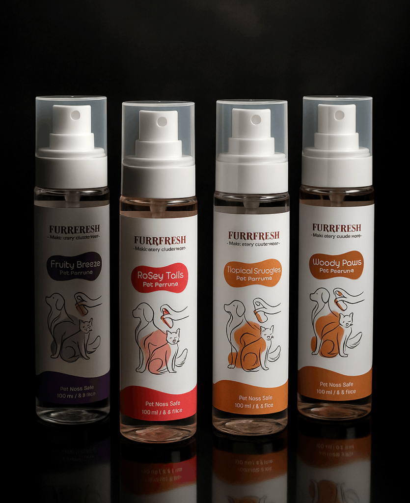
The product world
Four variants. Each designed as an individual identity within a unified system.
Presence
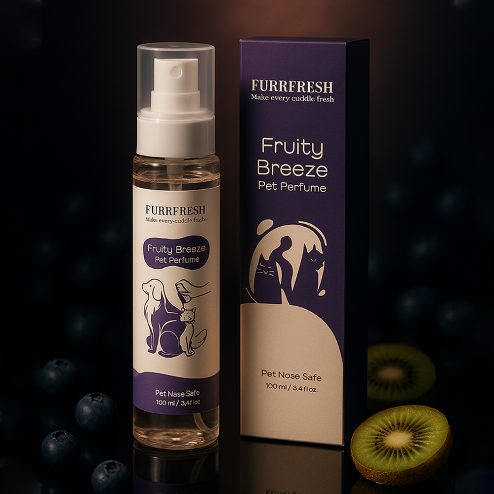
Fruity Breeze
The lightest in tone. Fresh, soft, and approachable. The colour and composition reflect ease and everyday use.
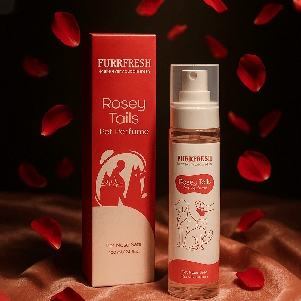
Rosey Tails
Warmer and more expressive. A slightly richer tone, suggesting comfort and familiarity.
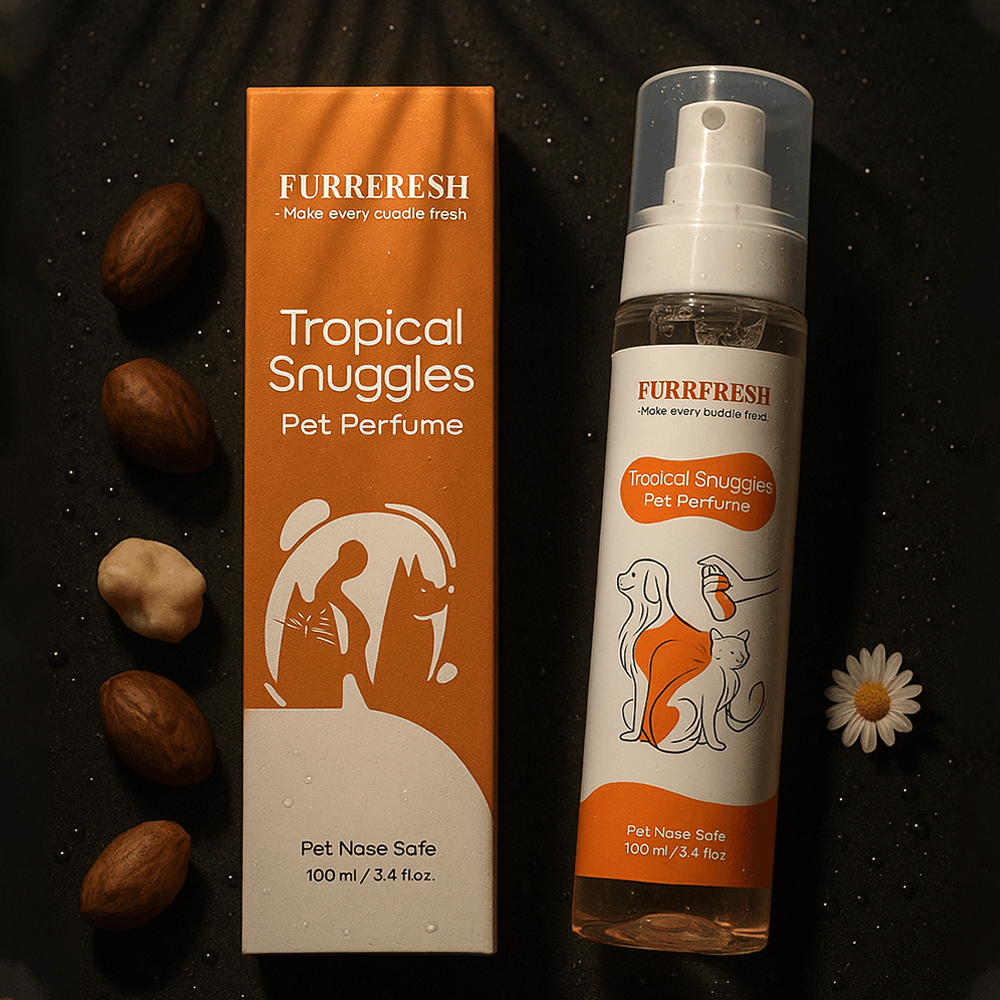
Tropical Snuggles
The most vibrant within the system. Designed to feel energetic without becoming loud.
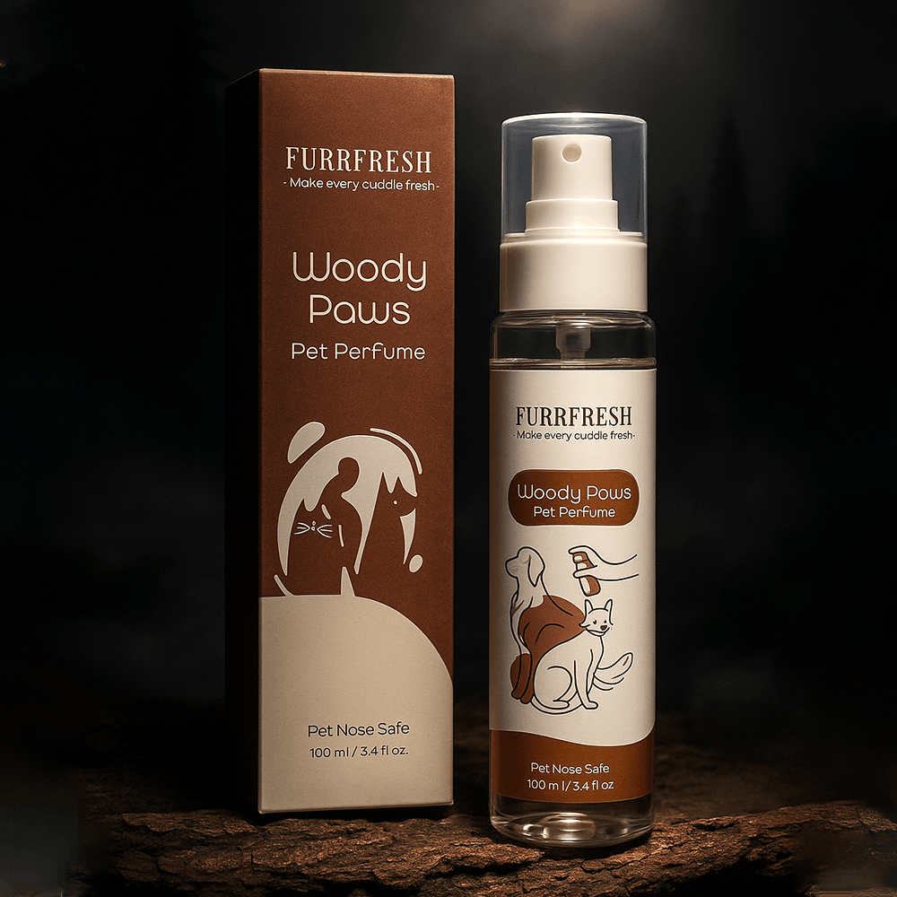
Woody Paws
Grounded and deeper in tone. The most mature variant — carrying a sense of calm and stability.
PACKAGING EXECUTION
The system extends seamlessly across both formats.
The bottle labels are clean and readable at a glance, designed for quick recognition.
The mono cartons carry stronger colour presence, allowing the products to stand out on shelves while still maintaining alignment with the bottle.
The transition between bottle and box is consistent – no shift in visual language.
Matte surfaces and controlled colour application ensure the product feels premium without appearing fragile or overly styled.
The system is scalable — allowing future variants to be added without redesigning the structure.
Momentum
What this project taught me
The Creative Director's Reflection
Furrfresh was an exercise in balancing contrast. Not visual contrast but conceptual. The challenge was not making the packaging minimal. It was making it minimal without losing warmth.
Removing elements is easy. Retaining character while doing so is not. The instinct in this category is to lean into playfulness — to make the product feel immediately friendly.
This project required holding back. Allowing the design to feel calm, and trusting that warmth can come from small, intentional details rather than visual noise.
This project reinforced a key idea: that simplicity is not reduction — it is precision.