Brand Experience System
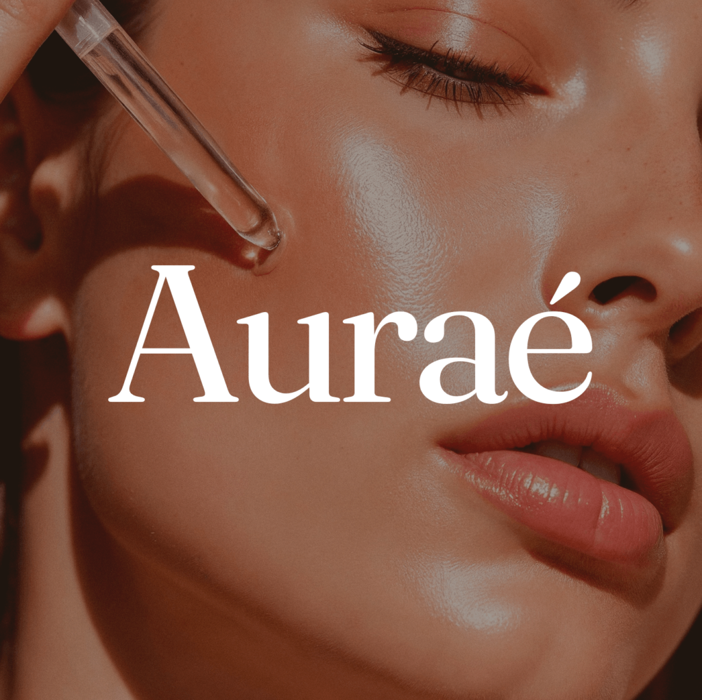
Auraé - Crafting a premium skincare identity
Type: Self-Initiated Strategic Case Study
Scope: Brand Strategy · Visual Identity · Packaging · Website UI
The problem worth solving
Skincare became a performance.
Auraé made it a moment.
Modern luxury skincare has a paradox at its centre. The category sells calm and self-care, then delivers twelve-step routines, clinical ingredient lists, and packaging that looks more like a laboratory than a ritual.
The consumer is being served complexity when she came for ease. She wants fewer, better things. She wants to feel something when she opens a product, not read instructions.
Auraé was built around a single hypothesis: that luxury skincare should feel like a quiet moment of sensory presence, not a performance to be optimised.
Signal
Brand Strategy
The strategic foundation
Before any visual decision was made, the brand needed a clear position. Not a mood board. A point of view.
Auraé’s position was built on that distinction. Not performance. Not science. Presence. The brand would speak to the ritual, not the result because the women this brand is for already know the result matters. What they’re missing is
the experience of getting there.
Tone of voice:
Calm, not dramatic. Poetic, not flowery. Minimal, not cold. Present, not rushed.
Experience
“For modern women who value intention, Auraé is a luxury skincare ritual brand that turns daily care into a moment of calm and sensory presence.”
Visual Identity
The identity was built to feel timeless and adaptable.
The brief to myself was clear: warm, tactile, intimate, and serene.
The palette was anchored in skin and earth – warm enough to feel human, muted enough to feel considered. What the palette deliberately avoids: white. Pure white is clinical. Cream Porcelain gives the lightness without the coldness.
Two typefaces. A variable serif carries the brand’s poetic register in headlines and product names. A sans-serif as the body face neutral enough to disappear, precise enough to feel intentional. The combination gives the brand both voice and structure.
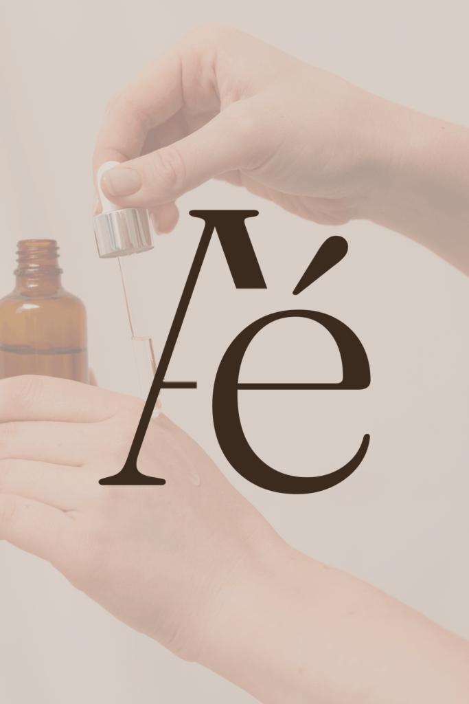
Identity Mark
The mark
The Auraé brandmark was designed to hold the brand’s entire register in a single glance. Set in Fraunces, the letterforms carry warmth without decoration
The é – a small but deliberate detail that gives the name its poetic character and nods to the French tradition of luxury skincare without borrowing its clichés.
The mark works in two weights: a lighter version for packaging surfaces where the material does the luxury work, and a slightly heavier version for digital and print contexts where contrast is needed. Both communicate the same thing: considered, calm, unhurried.
Consistency
The product world
Four products. Each named, each distinct, each part of a unified ritual. Packaging was designed to feel the same.
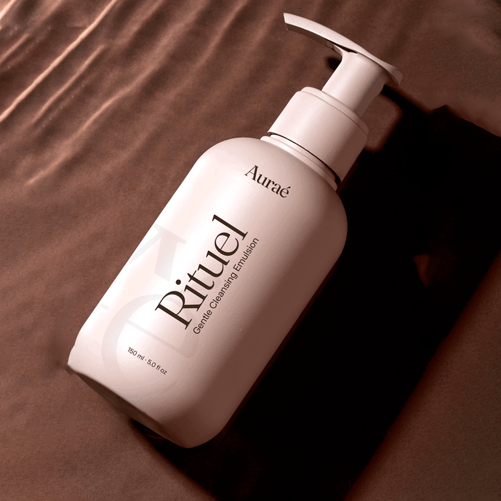
Rituel — The Cleanser
The entry point to the ritual. Rituel’s packaging establishes the brand’s register before any other product is opened. Designed to feel like a considered beginning, not a functional step.
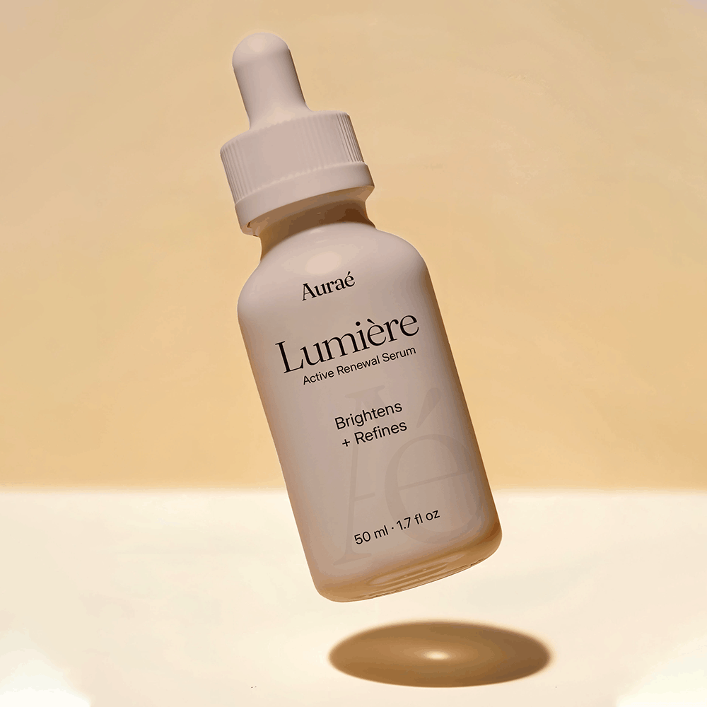
Lumière — The Serum
The serum is the most concentrated, the most potent, the smallest in form. Lumière — light — carries both the product’s function and its feeling. The packaging is precise, elongated, restrained.
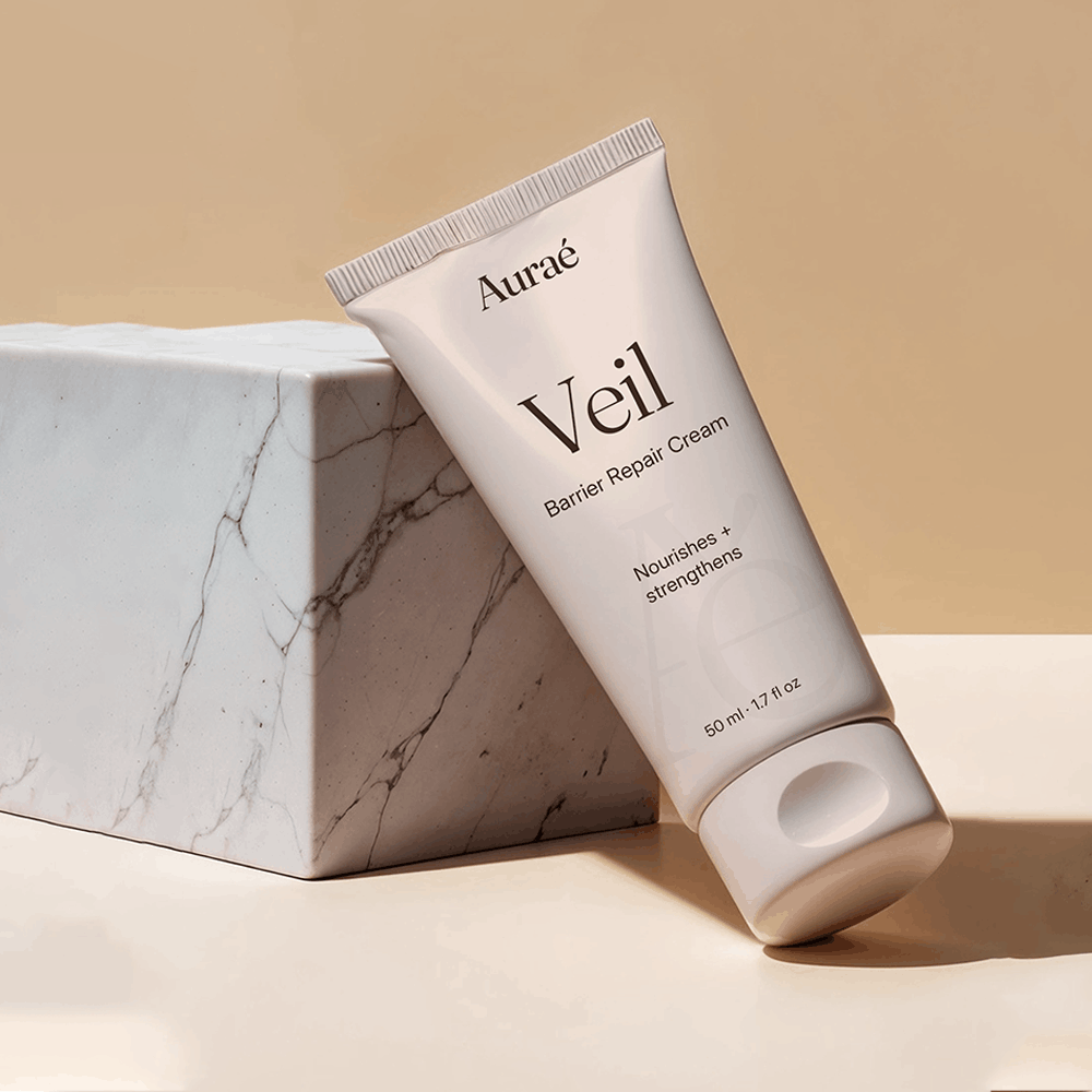
Veil — The Barrier Repair Cream
A product whose name does the strategic work. Veil implies something soft placed between skin and the world. The packaging reflects: present but not intrusive, substantial but not heavy.
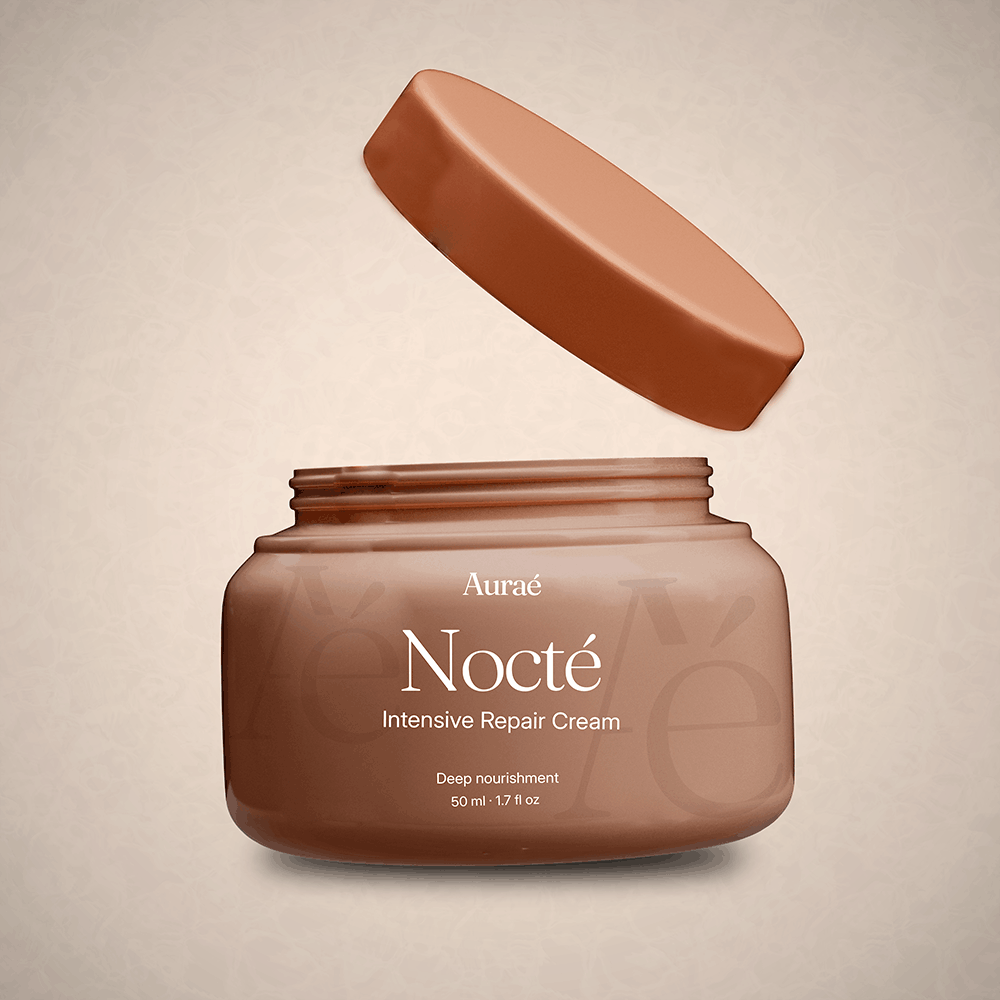
Nocté — The Moisturiser
Named for the night. Nocté is the end of the ritual — the product applied when the day is over and the only audience is the person in the mirror. The packaging is the deepest in tone, the most private in feeling.
Website Experience
The digital ritual
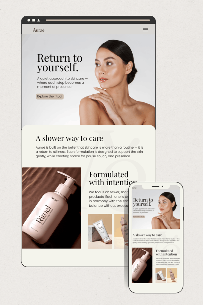
A skincare brand’s website is where the ritual has to be felt before a single product is purchased. The design challenge for Auraé’s digital presence was not conversion, it was immersion. A visitor should feel the brand’s world within the first scroll.
Navigation is minimal. The product pages lead with the product name and its feeling before any ingredient or claim. The checkout experience maintains the same visual register as the rest of the site because the moment of purchase should feel as considered as the moment of use.
The typography scales dramatically between desktop and mobile — the display headlines at desktop size were large, which was intentional. On mobile the hierarchy compresses without losing the register.
Colour usage online mirrors packaging. The website and the packaging could sit side by side and be recognised as the same world.
Precision
What this project taught me
The Creative Director's Reflection
Auraé was the first project where I deliberately worked as a creative director rather than a designer. The distinction matters more than it sounds. A designer solves the visual problem in front of them. A creative director defines the problem first, then solves it. With Auraé, I set my own brief, wrote my own constraints, and made decisions I had to justify to myself before making them. When there was no client to approve a direction, the only test was: does this serve the brand’s premise?
This project exists to prove a specific thing: that end-to-end brand building — from strategic premise to packaging to digital presence — is a single act of creative direction, not a series of separate design tasks.
Every decision in Auraé was made in service of one idea: skincare as a moment of calm presence, not a performance to be optimised.
Next project
Amol Parashar — Pitch Deck
Strategic Communication · Film & Entertainment